Introduction
The traditional homepage hero layout—consisting of a large background image, a centered headline, and a single call-to-action button—is becoming less common. As visitors become more accustomed to fast, interactive interfaces, standard slideshows are seeing lower click-through rates. Modern web design is shifting toward layouts that organize and present information more efficiently.
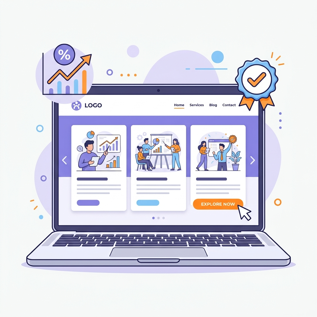
Among these new layouts, Multi-Panel Layouts and Asymmetric Grid Rows have emerged as popular options. By organizing content into structured, interactive blocks, these layouts allow you to showcase features, integration options, and testimonials simultaneously without overwhelming the user.
In this design guide, we will explore the psychology behind multi-panel layouts and look at best practices for building an asymmetric homepage grid on WordPress that drives conversions.
What are Multi-Panel Layouts and Asymmetric Grid Rows?
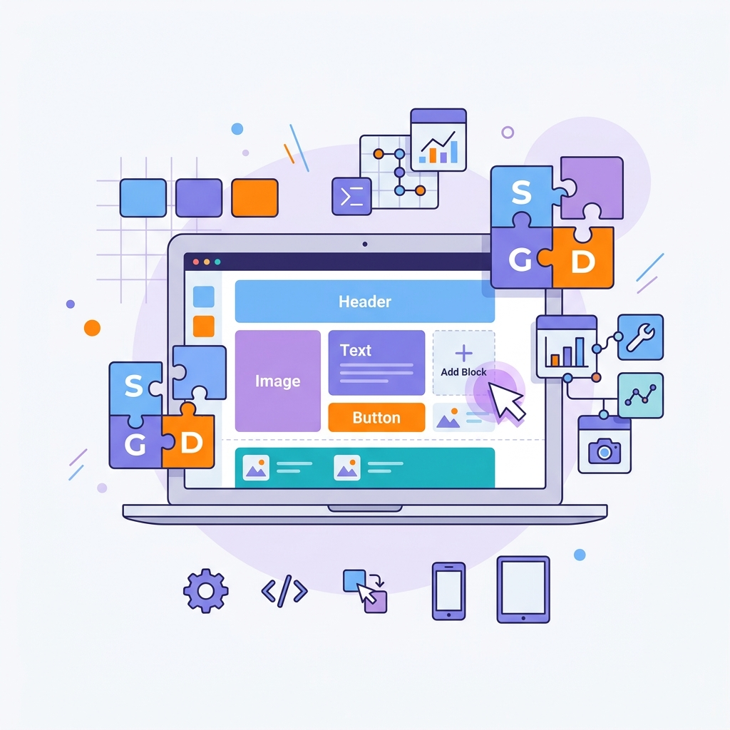
Multi-Panel Layouts organize diverse content elements into rectangular panels of varying aspect ratios. Instead of a single vertical list, content is grouped into a grid of distinct cells.
Asymmetric Grid Rows take this a step further by breaking the symmetry of standard columns. By mixing wide panels with narrow ones, or shifting row offsets, the design gains visual interest. This layout style is ideal for landing pages because it naturally guides the visitor’s eye to key areas.
The Psychology of Multi-Panel Design: Why it Converts
Multi-panel grids are effective conversion tools because they align with how users process information online:
- Cognitive Chunking: The brain processes information more easily when it is grouped into distinct blocks. A multi-panel layout breaks copy into manageable pieces, preventing cognitive overload.
- Visual Hierarchy: By using asymmetrical sizes, you establish a clear hierarchy. Large panels draw the eye first to key features, while smaller panels support with secondary details.
- Curiosity & Micro-Interactions: When columns expand or swap backgrounds on hover, it encourages interaction. This keeps visitors on the page longer, which can lead to higher conversion rates.
Designing Asymmetric Grid Rows: Best Practices
To design an effective asymmetric layout, use a balanced layout grid (such as a 3-column setup where one column spans two-thirds of the width, or a 4-column row with staggered heights). Since text often floats directly over panel backgrounds, choose images with clear space or use dark/light overlays to keep the copy readable. Translucent frosted glass cards look clean and separate text fields from busy image backdrops. Finally, pair a bold sans-serif font for headings (like Montserrat or Outfit) with a highly legible body font (like Inter or Open Sans).
Conclusion
Multi-panel layouts and asymmetric grid rows offer a clean, organized, and modern way to present information on your homepage. By utilizing visual hierarchy, readable contrast, and interactive hover effects, you can build an engaging user experience that drives conversions.